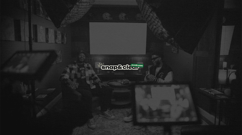
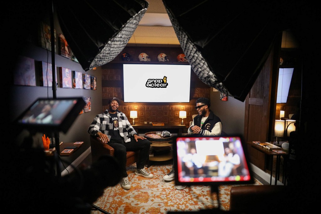
The Snap & Clear project is a multifaceted branding initiative designed for a podcast that addresses the complexities faced by former athletes transitioning to life beyond sports. The podcast provides a supportive platform for open dialogue, tackling the mental health challenges accompanying this transition. My role as the designer involved creating a cohesive visual identity that resonates with the podcast's mission to inspire and uplift its audience, ensuring that every design element reflects the journey from uncertainty to empowerment.
In developing the branding for Snap & Clear, I aimed to create a visual narrative that aligns with the podcast's core themes of resilience, growth, and community support. My approach began with extensive research into color theory and psychology, utilizing a color palette that included green for renewal, yellow for optimism, and a minimalist black backdrop to convey sophistication and depth. This thoughtful selection set the tone for the brand. It influenced the typography choices, with the main font being Unbounded for its boldness and clarity, complemented by Inria Sans for a modern, approachable feel.
Throughout the design process, I prioritized incorporating personal touches to enhance authenticity. Hand-drawn elements, such as scribbles, add a relatable and human aspect to the branding, making it more inviting for listeners who might feel isolated in their journeys. By harmonizing these elements, my vision was to establish a visual identity that feels both clean and inspiring, encouraging former athletes to embrace their new paths.
A primary challenge during this project was ensuring that the brand identity resonated with the target audience—former athletes navigating complex emotional landscapes. Balancing the minimalist aesthetic while conveying the depth of the podcast's subject matter required careful consideration of every design choice. It was essential to create an identity that captured attention and reflected the authenticity and vulnerability that the podcast embodies.
Another significant challenge was translating the hosts' narratives and experiences into visual elements that could effectively communicate the podcast's mission—achieving this required multiple iterations of design concepts and continuous feedback from the hosts to ensure that the branding resonated with their vision. This collaborative process was vital in overcoming the initial hurdles and refining the brand to meet the audience's needs.
YouTube Banner: Designed to capture the essence of the podcast with bold visuals and a clean layout, engaging viewers immediately.
LinkedIn Banner: Professional yet inviting, showcasing the podcast's mission while maintaining brand consistency across platforms.
Main Logo: A striking design featuring the podcast title and tagline, symbolizing hope and resilience with a bold font and color palette.
Secondary Logo: A simplified version of the primary logo, versatile for various applications without losing brand identity.
Favicon: A compact representation of the brand for digital platforms, ensuring easy recognition in browser tabs.
Typography System: The combination of Unbounded and Inria Sans offers a modern, clean approach, enhancing readability and aesthetic appeal across platforms.
Hand-Drawn Elements: Including scribbles adds a personal touch, reinforcing the brand's authenticity and connection to its audience.
